BT 2013 advertising material: Difference between revisions
mNo edit summary |
|||
| Line 30: | Line 30: | ||
[[File:BT2013-Poster-de.png|200px|deutch version of poster]] | [[File:BT2013-Poster-de.png|200px|deutch version of poster]] | ||
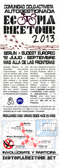
[[File:BT2013-Poster-cas.png|200px|castellano version of poster]] | [[File:BT2013-Poster-cas.png|200px|castellano version of poster]] | ||
== Social media Logos == | |||
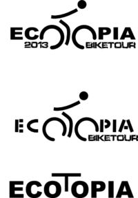
Made using the poster SVG file, for use on social media environments (that normally show squared logos) | |||
[[File:BT2013-Logo-en.png|150 px|English version for social media]] | |||
== Website Banners == | == Website Banners == | ||
Revision as of 13:31, 19 June 2013
On may there was the need to restructure the website and give it a new look, also new posters and flyers were needed...
Flyers
Berlin Critical Mass April Flyer
tim and kate brought this flyers to the monthly Critical mass in berlin
http://www.ecotopiabiketour.net/share/bt_2013/media_material/flyers/berlin_CM_april/
May Flyer
Agnes draw a flyer based on the early information on the route, flyers were made on Inkskape, the SVG file can be found here (uploaded on 09/Jun/2013)
Poster
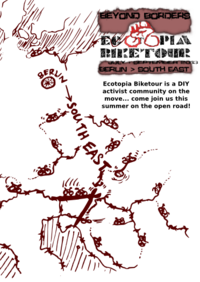
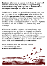
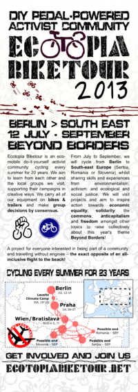
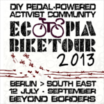
using kate's drawing, agnes flyer and last year poster design, on june, taborda prepared the first version of this year poster - that can/should be adapted to a non-year connected general poster
Translated versions of the poster text to make new poster versions
- original svg file (created with Inkskape)
2 posters per page in pdf format (nice to print on A3...probably work on A4 also):
Social media Logos
Made using the poster SVG file, for use on social media environments (that normally show squared logos)
Website Banners
Temporary banner
the first temporary banner was set up on april: http://www.ecotopiabiketour.net/share/bt_2013/media_material/Temporary%20logo/BTbannerbt3.jpeg
other attempts
and some other attempts:
Banner Drawing
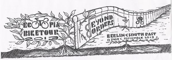
kate made a beautiful drawing to be used on the website, after scaning, taborda used Inkskape 0.47 to vectorize the drawing, introduce text and color.
the original svg file can be found here
Fonts used
The same fonts from last year were used:
- Billy-argel Popcorn Sketch (Free for Non-Comercial use)
- Defused (Free for Non-Comercial use)
Also Purisa Font (available on tlwg-font package, default on most recent linux versions) was used for the year number on the banner drawing for the website
