BT 2016 advertising material: Difference between revisions
Flyer 2016 trash |
jpg flyer |
||
| (One intermediate revision by the same user not shown) | |||
| Line 1: | Line 1: | ||
== Posters and Flyers == | == Posters and Flyers == | ||
===Flyer=== | |||
[[File:160328flyerENG.pdf|200px|thumb|left| | ===Flyer TRASH=== | ||
for preview, the files in jpg, for printig in pdf: [[File:160328flyerENG.pdf|200px|thumb|left|PDF-flyer2016]] | |||
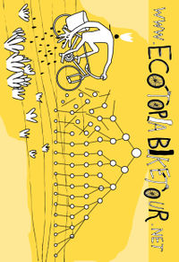
[[File:160328flyerENGpreview.jpg|200px|thumb|left|PREVIEW Frontside flyer2016]] | |||
[[File:160328flyerENGpreview2.jpg|200px|thumb|left|PREVIEW Backside flyer2016]] | |||
=== Stickers 2016 === | === Stickers 2016 === | ||
Latest revision as of 14:54, 28 March 2016
Posters and Flyers
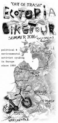
Flyer TRASH
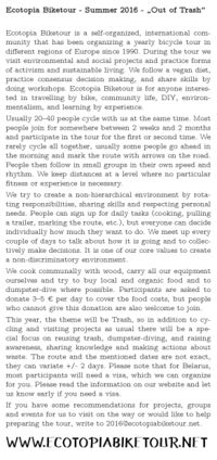
for preview, the files in jpg, for printig in pdf:
Stickers 2016
Here are the different proposals for the stickers.
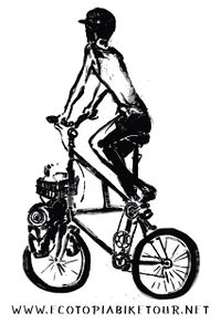
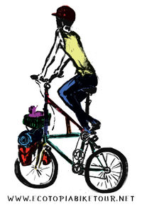
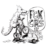
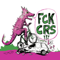
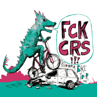
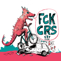
I think we should take maximum 3 of them.
Autumn 2015
This set of a poster and a flyer describes the Biketour in general and mentions the region where it will happen.
The files can be found here: Poster, Flyer.
To make it easier to tell which flyer/poster is in what language (can you tell apart Czech from Slovak, Polish from Lithuanian, Belarusian from Russian?), the language code is hidden on the flyer and poster. On the flyer it is on the front on the bottom left of the hill, on the poster it is in the back wheel of the big bike on the bottom left.
The translations are collected in a pad. The text for the flyer is the whole text except the headlines in the second-last paragraph. The text for the poster is the first paragraph, with the last sentence of the third paragraph (non-discriminatory environment) inserted as second-last sentence.
The translations for the country names in the map can be easily looked up by opening the article about the country and then searching the translated article in the language list on the left: Estonia Latvia Lithuania Belarus Russia Poland
Technical information
The files were created in Inkscape. The flyer is one third of an A4 page, so there are three flyer copies on one page. This was done using the “Clone” function (Alt+D), so when the left version of the flyer is edited, the two copies of it are updated automatically.
Web Artwork
Artwork for the website and Facebook is available here.
See Web artwork for a how-to.
Fonts
Here is an overview over which fonts we use in the flyers and posters. In some cases, the font that has been chosen for the layout does not have any Greek or Cyrillic characters available. For the flyers in languages that use Greek or Cyrillic characters, we try to find an alternative that looks similar.
Headers
Used in the headers, such as “ECOTOPIA BIKETOUR” and “BALTIC STATES & BEYOND”. Sometimes used for the country names on the map.
For Latin, we use Nizam Bold. This is a font we created ourselves based on the hand-writing that Nizam used in the artwork that he created for our website in 2014.
For Cyrillic and Greek, we use Mauryssel.
Short texts
This is used for short texts, such as the description of the tour on the poster. Sometimes used for the country names on the map.
For Latin, we use Purisa.
For Cyrillic and Greek, for the lack of a better alternative we currently use Comic Sans MS.
Long texts
This is used for the long description of the tour on the back of the flyer.
Currently, we use Earthbound. It has been pointed out that this font doesn’t support any accents, or Greek or Cyrillic. Thus it should be replaced. One proposal was to use Sansation. This should be tried out. On the Greek and Cyrillic flyers, we already use Sansation.